
Exploring GMC Properties
The main output of CPROPS and cpropstoo are tables of cloud parameters. In astronomy, a common table file format is that of the FITS table where FITS refers to the Flexible Image Transport System. The original FITS format was designed for images, but it has been extended in hundreds of different ways including for tables and catalogs. We can explore the table from one of two approaches. The first is in an exploratory mode, and I recommend using the programs TOPCAT or glue. The second mode is more making proper plots and doing good analysis using python. If you are given a binary table (of GMC properties), here’s how to start exploring.
TOPCAT
TOPCAT has extensive documentation but this will focus on a few methods that we use a lot. To start TOPCAT on a server with it installed, you can just call
topcat table_name.fits
where table_name.fits is the filename of the table you are exploring. This will pop up main window which looks like this:
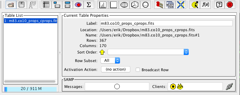
You can mouse over the different buttons in the top row to get some help text about their functions. The main thing you’ll want to do is to make bivariate plots, which is the button with white square. This brings up a plot window for the table you have selected. You can then select from the bottom-right panel all the different keys (i.e., columns) in the table to plot them against each other. Let’s start by making a classic GMC properties plot: the luminous mass vs the virial mass of the cloud. These are all calculated using the methods described in the CPROPS paper. The tag name for the luminous mass is just MASS_EXTRAP and the virial mass is called VIRMASS_EXTRAP_DECONV, both of which have units in solar masses. Go ahead and make this plot by changing the axes accordingly. The graph should look something like this:
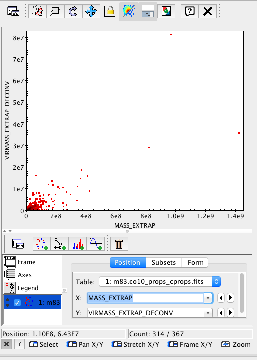
This isn’t very illuminating since all the points are clustered down in the bottom of the plot. Go ahead and click the axes tab in the bottom left and click X log and Y log to make this into a log-log plot:
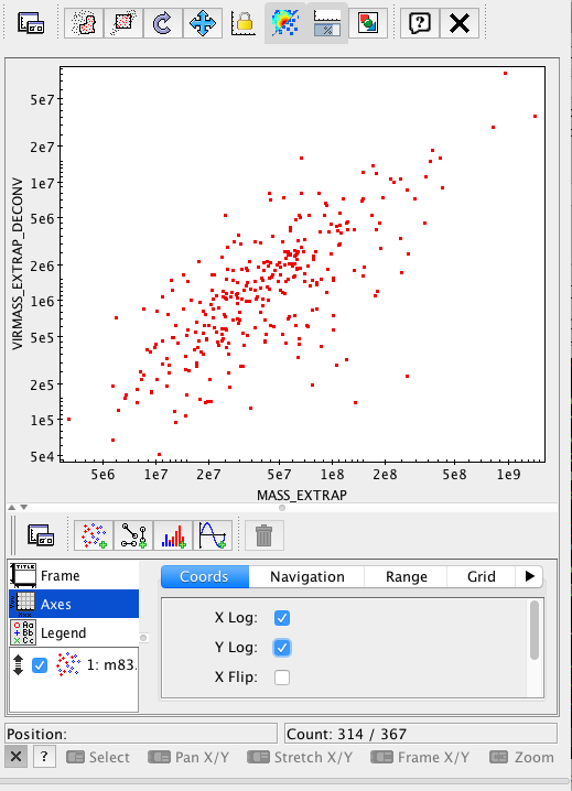
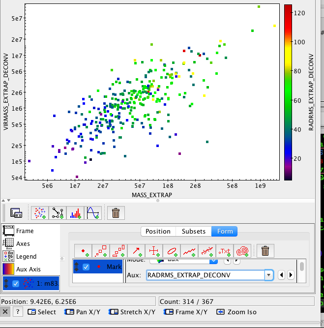
Behold a correlation (with some offset, perhaps something is wrong!). This is pretty cool, but you can also make the plots with respect to other properties. Let’s colour-code the points by cloud radius. Do this by clicking on the table name in the lower-left and returning to the screen where you select variables. Then, click on the Form tab. If you scroll down, you can make the points bigger and change their symbols. You can also change the Mode to include Aux meaning use the colour as an auxiliary variable. Then, beneath it, select RADRMS_EXTRAP_DECONV as the radius and you should end up with a plot like this.
Finally, you can check out the table itself if you return to the main TOPCAT window and click on the button that looks like a spreadsheet (it says “Display Table Cell Data” when you mouseover). This brings up the full table and you can scroll through. However, everything in TOPCAT is linked. You can click on a single point in the plot and it will highlight the row in the table and vice versa. This allows you to identify problems in the data.
astropy.tables and matplotlib
Plotting using TOPCAT is great for exploring data, but it isn’t good for making high quality figures. Nor does TOPCAT have a great deal of mathematical functionality. Thus, we turn to python to actually make figures and analyze data. Thus, TOPCAT is good for exploring and python is good for finalizing your results. We can also load the table into python which provides direct access to the data. To make the same plot as above, we can use the astropy package and its table functionality. To do this, we can run in python:
# Import some libraries
from astropy.table import Table
import matplotlib.pyplot as plt

# Next load the file.
mytable = Table.read('table_name.fits')
This loads the FITS binary table into a astropy Table object, which is documented very well right here. Now, we can make the same plot as before using matplotlib.
figure = plt.figure(figsize=(4.5,4)) #figure size in inches
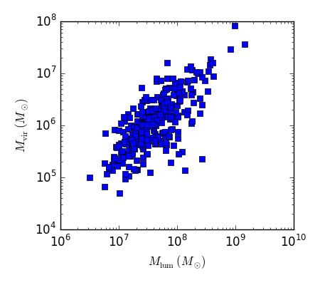
plt.loglog(mytable['MASS_EXTRAP'],mytable['VIRMASS_EXTRAP_DECONV'],
marker='s',linestyle='None')
# Note that matplotlib understands LaTeX math in the code below
plt.xlabel(r'$M_{\mathrm{lum}}\ (M_{\odot})$')
plt.ylabel(r'$M_{\mathrm{vir}}\ (M_{\odot})$')
plt.tight_layout()
plt.savefig('MlumMvir_matplotlib.png')
This leads to the gorgeous figure that is almost ready for the journal.
Homework
Use TOPCAT and matplotlib to make the “classic” plots of GMC properties, all on log-log scales.
- Virial mass vs. luminous mass
- Radius vs. line width (velocity dispersion)
- Luminous mass vs. radius
In the language of CPROPS you will want to use
- Virial Mass =
VIRMASS_EXTRAP_DECONVin solar masses - Luminous mass =
MASS_EXTRAPin solar masses - Radius =
RADRMS_EXTRAP_DECONVin pc - Line width =
VRMS_EXTRAP_DECONVin km/s
Note that the EXTRAP tag means that the value has been extrapolated to the value that is expected in the case of infinite signal to noise. The DECONV means that the value has been corrected for the response of the telescope (i.e., the so-called beam deconvolution for sizes and in the case of the line width for the spectrometer response).
Your code should overplot the lines for the Milky Way relationships for these trends as described in the Solomon et al. (1987) article. Go ahead and commit a single program to make these three plots into github. If you’re having issues, go ahead and commit and send questions!